When analyzing data, selecting the appropriate graph is crucial for effectively communicating insights. Below is a structured overview of common graphs, their purposes, and ideal use cases:
Bar Chart

Description: Rectangular bars representing the value of categories.
Data: One categorical (x-axis) and one numerical variable (y-axis).
When to Use: Compare quantities across distinct categories (e.g., sales by region).
Example: Comparing monthly revenue across product lines.
Avoid: Overcrowding with too many categories; use horizontal bars for long category names.
Line Chart

Description: Points connected by lines, typically over time.
Data: Time-series or sequential numerical data.
When to Use: Visualize trends or changes over time (e.g., stock prices).
Example: Tracking website traffic over a year.
Avoid: Irregular time intervals or too many overlapping lines.
Pie Chart

Description: Circular chart divided into slices proportional to values.
Data: Single categorical variable showing parts of a whole.
When to Use: Display proportions (e.g., market share distribution).
Example: Budget allocation percentages.
Avoid: More than 5–6 categories; use bar charts instead for precise comparisons.
Histogram
Description: Bars showing frequency distribution of numerical data.
Data: Single continuous numerical variable (binned into ranges).
When to Use: Analyze data distribution (e.g., age groups in a population).
Example: Distribution of exam scores.
Avoid: Confusing with bar charts; histograms show distributions, not categories.
Scatter Plot

Description: Dots plotted on x/y axes to show relationships.
Data: Two numerical variables.
When to Use: Identify correlations, clusters, or outliers (e.g., height vs. weight).
Example: Relationship between advertising spend and sales.
Avoid: Overplotting with too many points; use transparency or sampling.
Box Plot (Box-and-Whisker)
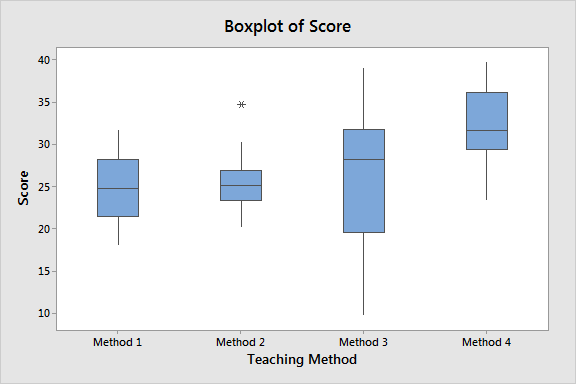
Description: Displays data quartiles, median, and outliers.
Data: Numerical data, often grouped by categories.
When to Use: Compare distributions across groups (e.g., test scores by school).
Example: Analyzing salary distributions across departments.
Avoid: Hiding small sample sizes, which can mislead interpretations.
Heatmap
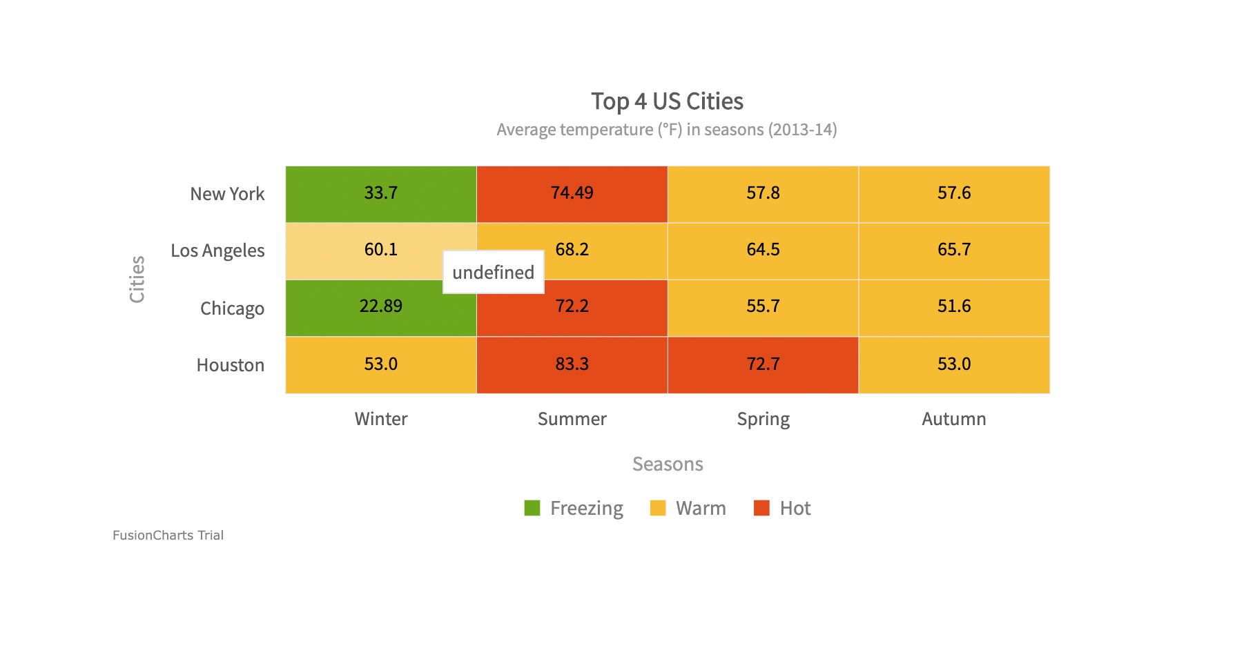
Description: Matrix of values represented by colors.
Data: Two categorical variables and one numerical variable.
When to Use: Highlight patterns or variances (e.g., user activity by hour/day).
Example: Correlation matrix between variables in a dataset.
Avoid: Poor color choices that obscure patterns (e.g., non-diverging palettes).
Area Chart
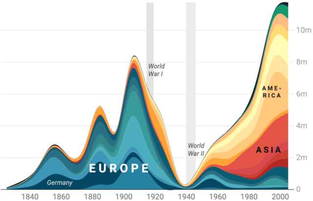
Description: Line chart with filled area beneath.
Data: Time-series or sequential data.
When to Use: Show cumulative trends (e.g., total sales over time).
Example: Stacked area chart for product category contributions.
Avoid: Overlapping categories that make interpretation difficult.
Bubble Chart
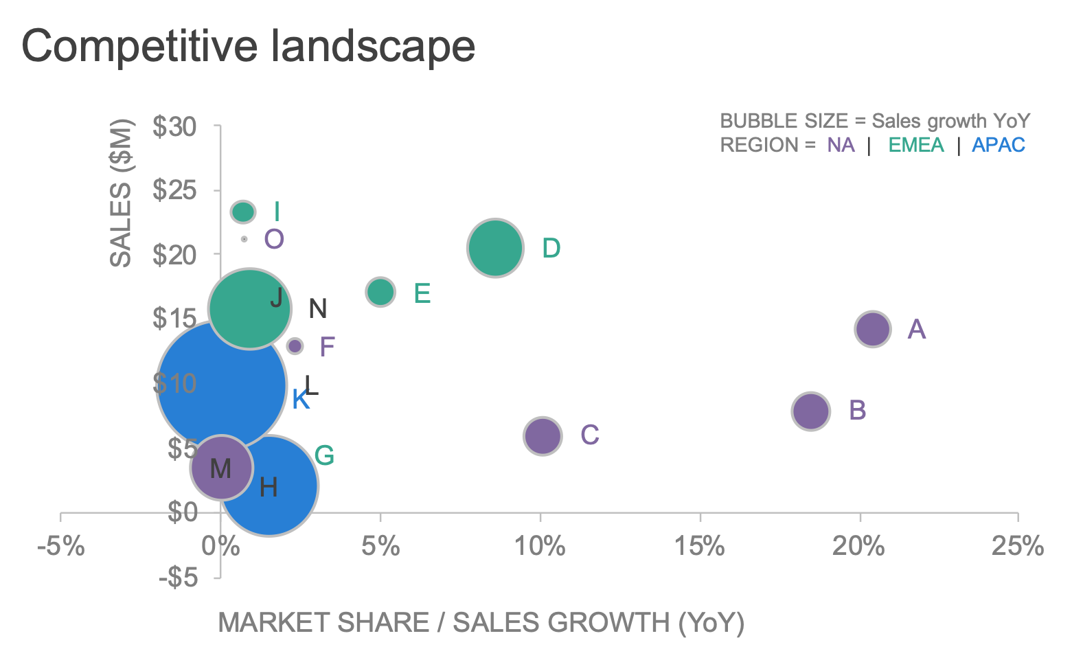
Description: Scatter plot with bubble size representing a third variable.
Data: Three numerical variables (x, y, size).
When to Use: Compare three dimensions (e.g., GDP, life expectancy, population).
Example: Visualizing country data with multiple metrics.
Avoid: Overlapping bubbles; use scaling or interactive tools.
Violin Plot
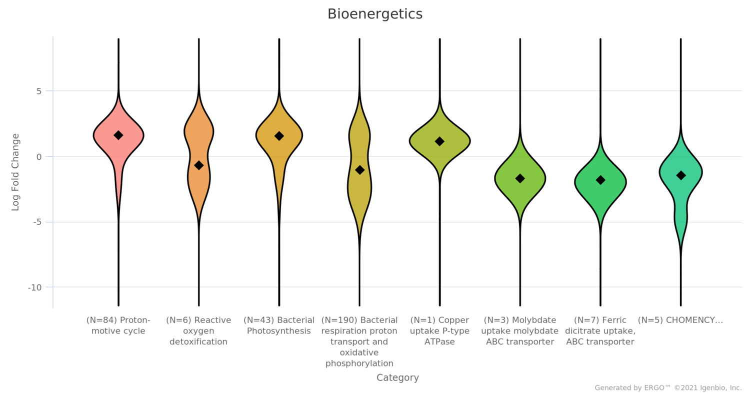
Description: Combines box plot and kernel density plot.
Data: Numerical data across categories.
When to Use: Detailed distribution analysis (e.g., bimodal distributions).
Example: Comparing protein levels across medical treatments.
Avoid: For audiences unfamiliar with density plots; use box plots instead.
Network Diagram
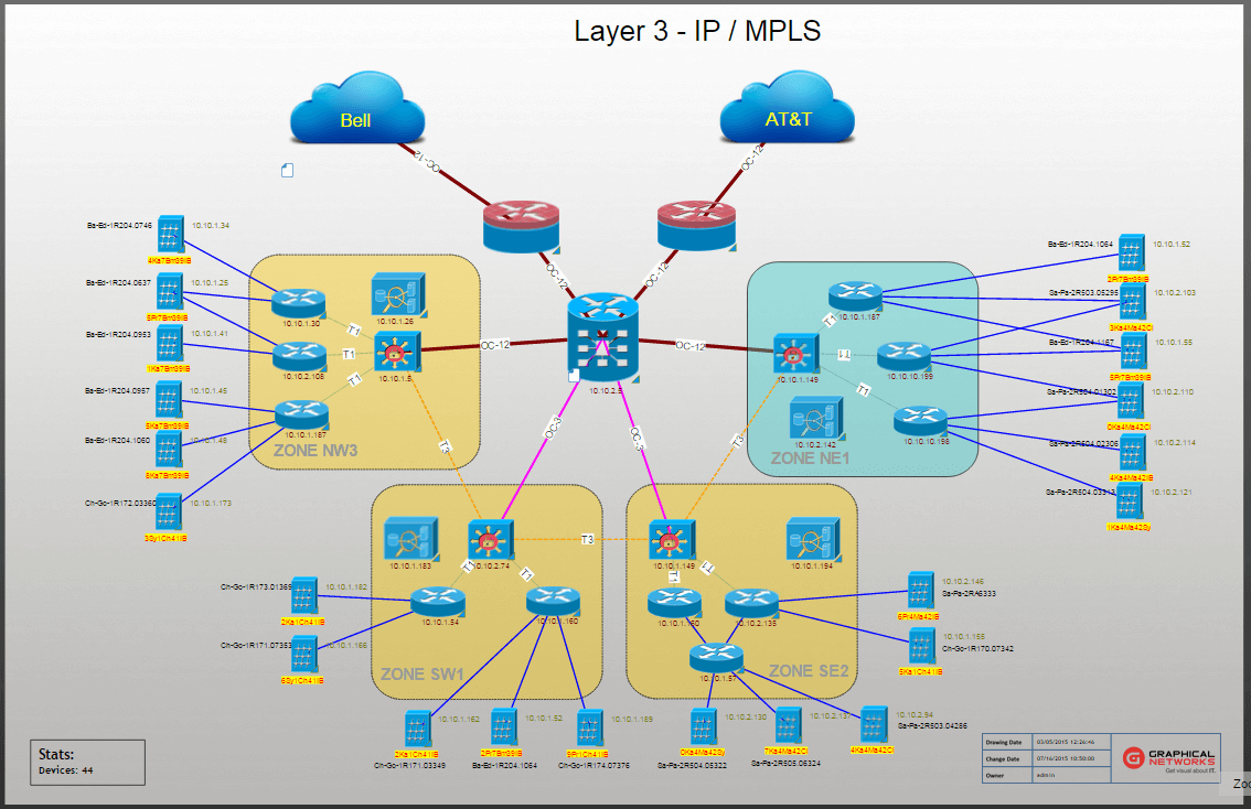
Description: Nodes (entities) connected by edges (relationships).
Data: Relational data (e.g., social networks).
When to Use: Analyze connections (e.g., social media interactions).
Example: Mapping organizational hierarchies.
Avoid: Overcomplicating with too many nodes; use filters or clustering.
Network Plot

Other Specialized Graphs
Waterfall Chart

Show incremental changes (e.g., financial statements).
Gantt Chart
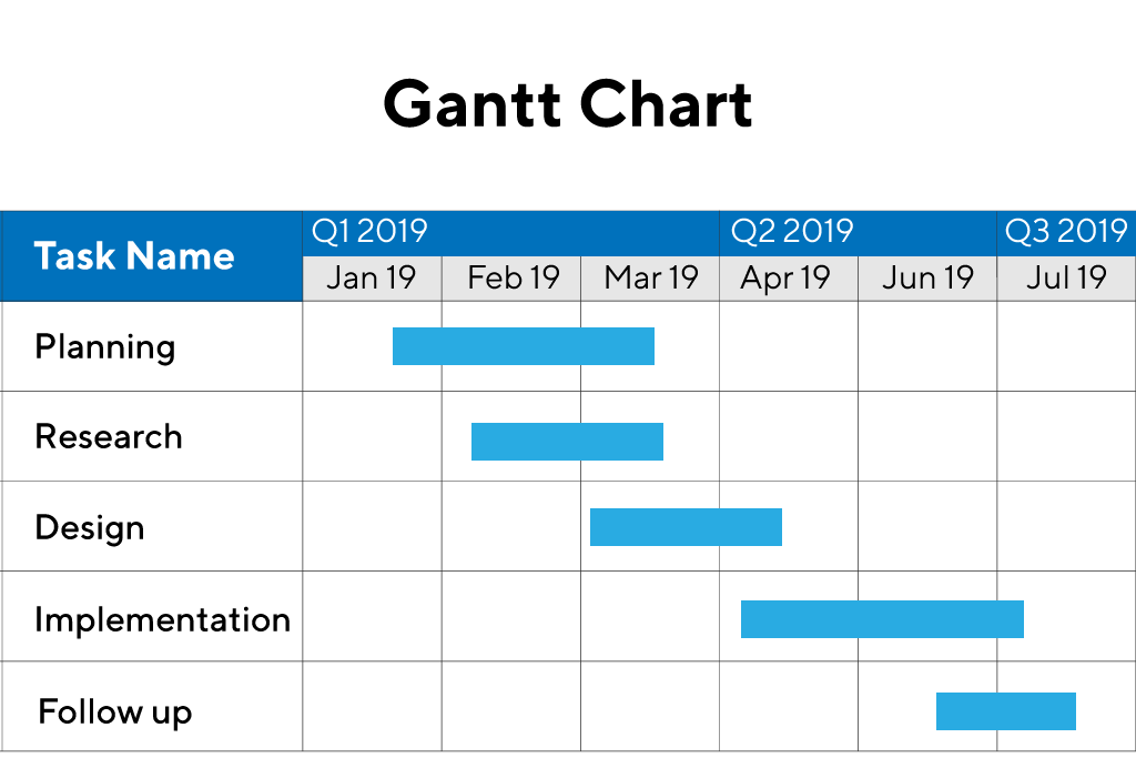
Track project timelines and task dependencies.
Radar Chart
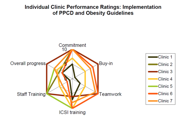
Compare multivariate data (e.g., skill assessments).
Geographical Map
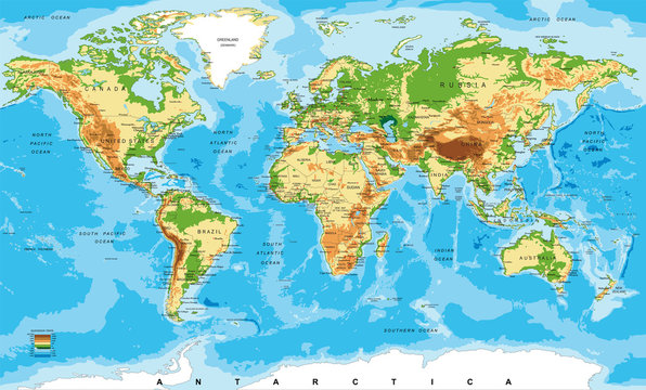
Spatial data analysis (e.g., regional sales).
Best Practices
Audience: Simpler charts (bar/line/pie) for non-technical viewers; advanced charts (violin/network) for experts.
Clarity
Avoid 3D effects, excessive colors, or misleading scales.
Context
Always pair charts with explanations to highlight key insights.
Aligning your data type and analytical goals with the appropriate graph, you can enhance clarity and drive actionable insights.
Leave a Reply